https://www.freebsd.org/where/
Level 1 heading 'Download FreeBSD' is not perceptibly different from the identically-worded visible title with a single sentence between the two. This heading appears to be redundant.
The very short 'Help to Test' section is no more than direction to visit the download page. Nonsense, we're already at the download page.
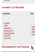
Generally, the page has become a slightly disorderly mix: choices, production quality (RELEASE), beta, development, snapshots, CURRENT, STABLE, general information, purchasing (RELEASE, presumably), archaic stuff, current stuff (derivatives (non-Project)), current stuff (ports (within the FreeBSD Project)). Begin improving this, partly through adjustments to heading levels.
Two new headings, level 1:
Production Quality
Development and Testing
… and so on.

